Curating and Creating Textures for Large Worlds on a Budget
This post was originally given as a talk at M+Dev 2022 on November 4th, 2022.

Hi everyone, My name is Nina Cammarata, I’m an Environment Artist at PUBG Madison working on PUBG. I’ve worked in games for almost 7 years now. Previously, I worked at NetherRealm on Injustice 2 Mobile and MKX Mobile. Here is a sample of things that I’ve worked on over my career.
At PUBG I’ve worked on most of the maps including Erangel, Miramar, Sanhok, Karakin, Haven, and most recently Deston.
Most of my work for PUBG centers around building art and materials so today I’m here to talk to you about how to determine which textures you’re going to use and how to make the most of those textures.
Assessing a large world can be very intimidating because of how much ground there can be to cover. When looking at the reference, sometimes it's hard to know what textures to make and which ones to skip, or which ones will be the most useful to you down the road on buildings or structures that you haven’t even thought out yet. Even after you figure out which ones you use, how do you make the most of them? Throughout this talk I’ll be focusing on realistic textures and scenes, as that’s what we focus on at PUBG, but this is applicable to any art style.

The first thing to consider is what your budget might look like. Budgets can change over the course of production, and there will always be optimization at the end, but it's good to have some foresight regarding what will be doable and what won’t (if you can) otherwise you might be left redoing a lot of things. When you have the scheduled time to redo stuff at the end that might not be as big of a deal but if you’re working on a time crunch, minimizing large scale rework is important.
That’s not to say that you have to pre-optimize everything all the time down to nothing especially if you don’t really know what your budgets are, but trying to replace a ton of textures at the end may or may not put a wrench in the schedule so it's good to work smart rather than throw a bunch of resources at it when you don’t have to in the first place. And either way, when you can save some performance in one place you might be able to spend it elsewhere on something cool, like better shaders.
When thinking about textures one major thing we should be thinking about is how many textures can we reasonably have in the game? How much memory do they take up? How much space do we have for this particular asset or set of assets? How do we use that space in the most efficient way and get the most bang for buck?
The second thing we’re concerned with is draw calls. For the uninitiated, draw calls, in general terms, are when the computer tells the GPU to draw groups of triangles on the screen. Each material on the object will add a draw call, so the more materials you have on an object, the more calls there will be.. So in terms of textures, say you have 6 types of brick, and they’re all a separate material. That will inflate the draw calls unnecessarily depending on what you’re making. Thinking about how you can cut that number down and use fewer materials effectively to achieve the same look early helps figure out what the textures need to be.
The larger the world, generally the tighter the budget. In larger worlds you generally have to spread out the same resources across a bigger space. You have to share resources with other parts of the game like characters, vehicles, etc, and if you have a lot of players like PUBG does

The next thing to do is look at the reference, or body of reference that you have and take some time to take a close look at it and break it down into parts. Here I will be focusing on tiling textures, but this process can be applied to almost anything, decals, grunge, props, tack ons etc. Here are a couple rules of thumb to keep and mind when analyzing your reference:
NUMBER ONE: Not everything can be cool and unique, and it probably shouldn’t be anyways. When everything is cool and unique, nothing is, it just becomes noise. Between areas of interest you need areas of rest where things are maybe a little less interesting. Not to mention the sheer volume of work that comes with trying to make everything unique. If you have time for that, and everything's meant to be a 1 to 1 replica, then maybe that’s what you want but in most games that’s not feasible because of either time or performance.
NUMBER TWO: Keep in mind the overall impact your selection has on the greater picture, because remember, we’re building for big worlds that have a lot of stuff in them. Every texture counts so they all need to go a long way.
NUMBER THREE: Keep your performance budgets in the back of your mind. Again, you don’t need to necessarily pre-optimize but just understand where the limits might be for your project. Working smarter not necessarily harder.
NUMBER FOUR: Remember you can write shaders to supplement the textures you have–we’ll touch on this later.
NUMBER FIVE: Not everything you see in the reference is good to go in the game. Sometimes reality is super weird. If you see it in a reference and think “Wow that’s weird and very rare”, that’s probably not something you want to include, even if it is accurate. Getting a high volume of reference will help you determine what is part of the “look” and what is an outlier. Outliers can be useful to solve one off problems but don’t rely on them as part of the bigger picture. If you have special locations or POIs the outlier reference can be more valuable there because those locations are one offs.
NUMBER SIX: You don’t need to try to get your “final” list of textures in one big go. It can be helpful to say “Ok right now I am just looking at rooftops” or whatever your category is. It's also ok to add onto it later, or replace textures, because you might be wrong about what textures are most important after the initial stage. This whole thing is an ongoing process that does take some iteration.
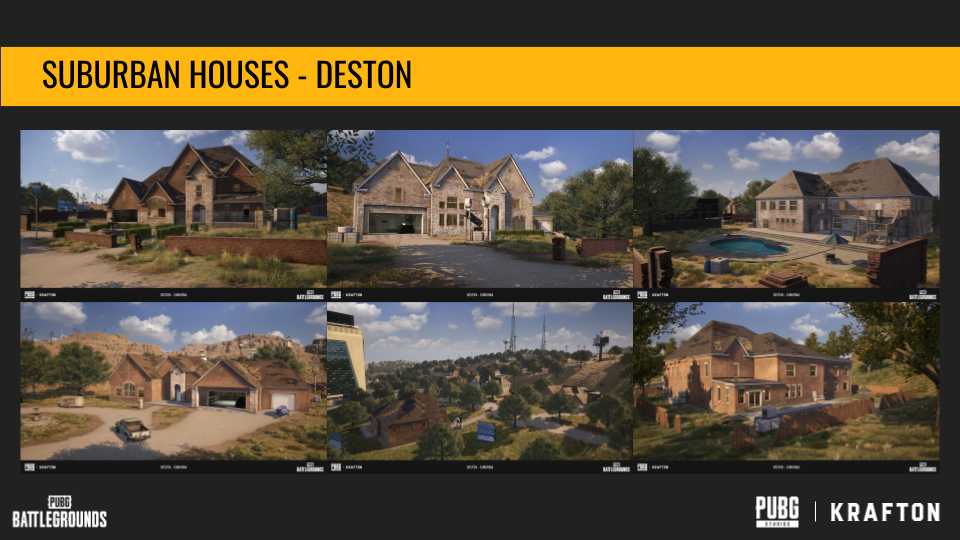
Keeping those in mind, let’s take a look at some of the Suburban buildings found in Deston and we’ll walk through how I broke these down. These were created as a versatile set able to be used over the entire map and in higher numbers. There’s only three of this building type total but they go a long way. These are just a couple shots of how these buildings look in game.

Here are some references that were used for these Suburban buildings. In actual production there were many more references than this. Just seven is nowhere near enough, it’s just what can fit on the slide so please keep in mind that any body of reference should be larger than this.
First off, here I will be ignoring tack-ons, props, glass, and other categories of assets. I’m primarily focusing on the main building materials. It can really help you get clarity to separate assets into categories and phases to try and make the whole process more manageable, which is exactly what I did here.We can see there are a lot of different building materials in the reference. We’ve got a lot of brick of varying types and patterns, a few stone variants, some roofs, plaster, and some miscellaneous others like trims.

I’ve outlined all the different building materials here in their respective categories. Brick, stone, other wall materials, accents, roofs etc.
This doesn’t encompass everything we’d need. For the other materials such as trims, or concrete, I’d do another pass that has more images that include that particular material. Of course there is probably overlap between some of these images and the other categories but I personally like to try and get some focused reference when I can.
Now that we’ve split the materials it's a little easier to digest, we can take each category one at a time and make a couple decisions about what to include and what to exclude. Let’s walk through one of the categories.

Let’s start with the siding. For Deston I knew that, ultimately, this needed to boil down to, essentially, one single look with a few subtle variants like color and small details. Our world is large and we have a lot of other building looks to accommodate throughout the map so I can only take up so much texture budget for these. So the siding needed to come down to basically one or two textures with a few alternate colors at most.
There are a lot of places to start in the reference, we have brick in blue, painted brick in teal, stone of a few types in pink, plaster in red, and a little bit of vinyl siding in green. Looking at this arrangement it's pretty clear what the outliers are. The plaster while being very “Texas” isn’t actually that common in suburbia comparatively to the brick buildings, and this was true of the larger body of reference as well. So while it would be great to have plaster buildings like this, it’s not part of the single look so it can go.
The same goes for painted brick and vinyl siding. There’s reference for it for sure but because of how far the textures have to be whittled down there’s no room for it. That leaves the miscellaneous stones in pink, and the brick in blue. A stone would be great as an accent material so the buildings aren’t 100% brick all the time so I set that category aside to do a more focused pass on and pick a stone.
Now that we know the main material for this look group is brick because of how commonly the material appears in the reference we can take a look at the specific bricks themselves.

Luckily in this case the bricks are pretty similar. There are some situations that would be much harder to narrow down–ruined brick next to clean brick, old next to new, brick for different industrial purposes, the list can go on. Even though these are pretty similar there’s still too many here, so we need to look at them critically.
It helps to use any contextual knowledge one might have here. For example, on these buildings I knew roughly how old the structures are supposed to be, the use case of the buildings, and that we likely wouldn’t have any destroyed assets using this brick. Those conditions can help us narrow it down. In this case the conditions say that the brick can’t be super old, but it also can’t be extremely new and clean. It has to be kind of like what you’d see on a house in the US that was built sometime in the last 50 years but not newer than 10. It would need some rough wear but not a lot–the kind of wear you see when someone just isn’t actively maintaining the surface all the time. Looking back at the reference with this knowledge we can glean a couple things.
The second image on the top row may be too rough so we’ll keep the image in case we need it but not consider it a primary surfacing reference. Conversely, the image on the bottom right is probably too clean and even–it would likely look a little fake because it’s just too perfect. Just a little bit too brand new. The rest of the standard bricks on this ref sheet are almost identical so we can consider them to be the same brick just in different colors. So that leaves us with one main brick texture. It would get very repetitive if all the buildings were the same color so I chose three variants for the albedo that were the most common in the greater body of reference.
Now in addition to the main brick, there are a lot of accent bricks. We can see a lot of herringbone pattern, some little tiny flat bricks, and straight line bricks as well. For these buildings I ignored any small infrequent types of brick, like the tiny bricks, because they were not represented in the reference enough to warrant their own texture. For the patterns like herringbone I had to decide whether it was worth having another brick texture or not. It ended up being a no, because it was possible to omit the herringbone pattern and no one would notice the difference. There’s also a lot of straight brick trim, and I didn’t think I would need a whole tiling texture of those, just one strip would be enough so it became a trim and was stuck onto a sheet with a bunch of other trims so that it didn’t add to the texture count by itself.

This process continues for every aspect of the scene. Roofs, trims, window frames, tack ons, everything. Just take a critical look at what is there and if you really need it or not.

There are always things that will need to be added after the fact. When adding to the library it's good to consider a few questions before adding it.
Is there something that is close enough in the library already? If yes, use that texture instead, don’t add more. Keep in mind that even if something is in the library, if its not used in the level its still using more memory. So say you had 5 bricks in the library, you don’t get to use those for free. Basically you have to pick and choose which library textures will be used in your level otherwise you’re going to be left with the same problem even though you’re technically not adding anything new. This can become a huge balancing act when your library is enormous (like it is on PUBG).
Can I substitute this for something else and have the same overall effect? Things don’t always have to be -exact- to the reference, sometimes the spirit of it is enough depending on what you’re making. If you can get away with swapping it out for something that’s not exactly the same but can achieve a similar vibe, and it's already used in your level, do that.
Why do I need this? What purpose does this new texture fulfill? Do you want to add it because it truly fills a need or just because it's slightly different than what you have? If it's the second reason or something similar, maybe zoom out, look at the bigger picture, and re-evaluate. Will it really make that much of a difference in the grand scheme of things? Can it be re-used in other situations? If the answer is no to one or more of these, it's probably time to use what you already have or find a more versatile solution.

Here’s an example of how I went through this process on PUBG with the town buildings in Sanhok. This was some the original reference provided to me by our art director. The goal here was to make these relatively noisy looks happen with the smallest amount of textures possible.
For this I followed basically the same process as the bricks. Almost everything here is wood or sheet metal on the exteriors so the categories are a little more granular that they are with our previous example. Ultimately, it came down to about five categories: a vertical wood, a horizontal wood, wide panels, corrugated metal, and plasters, with only about one or two in each category. Of course, throughout development we did add something here or there as needed, but the core group of materials stayed the same. We had to simplify as most games do, due to performance constraints and time. Here’s how the art for these buildings ended up looking:

As you can see there’s really only a handful of materials in the final version, we’ve got the corrugation, wide boards, vertical and horizontal boards, a wide wood beam which was added to the town kit a little later, and plaster. Of course, the variation in grunge, decay and color is very simplified, as most of our variation was gleaned from simple color tints either in the shader or using an alternate diffuse. We’ll come back to shader tricks soon.

The same sort of system can be seen being used here on Karakin. It's all the same concrete, cinder blocks, stone and plaster, just used in different ways. In the reference all of these materials were distinctly different from each other so this is really an example of the system of consolidating textures at work to make these looks work in game.

And here again on Haven. We have a warehouse set, and a city set, that largely use their own small buckets of textures. It's worth noting that for many maps we go through this selection process several times looking at completely different aesthetics of buildings. That way we do get some variety of look but, within their own categories the number of textures used is still pretty small.

It's finally time to talk about shaders. On PUBG we lean very heavily on our shaders to make our textures more versatile and get more out of them. Leaning on shaders allows us to use less textures, and in a lot of cases less decals as well.
Everything on these buildings is driven by a second UV channel and low-resolution packed masks. This isn’t revolutionary, though I think most people most commonly think of vertex painting when they think of blended shaders. Using a packed mask is basically the same thing, just the origin of the mask comes from an external source rather than from inside the editor.
Using the packed mask allows us to use lower resolution meshes because we don’t need the extra vertices to support vertex painting. Similar to the way we keep texture budgets in mind, we also have to remember our triangle budgets which can be pretty restrictive because again, the bigger the world, the more stuff that has to share the same pool of resources.
So how can a shader help us? You can add almost anything you want to a shader depending on its usage. You could add dirt, snow, or moss, to the tops of your rocks and structures. That wouldn’t even require use of a mask channel.
You could add controls for modifying aspects of the texture set.
Either of those would help you create alternate looks, using the same textures. A gnarly concrete could easily go from super grainy and rough to smooth and shiny by pushing and pulling the sliders. Would it be the same as a uniquely crafted texture for that specific situation? No. But could you get it close enough for a minor one or two off use case and save yourself the budget and time associated with a new texture. And that’s what it's all about when you have a very tight budget, employing as much “trickery” as possible to get to a result where the player cannot tell the difference. It's up to you to decide if it's close enough or not, and whether or not you have the budget to add more.
Here are a few samples from PUBG materials:

The first and most obvious function here is to blend materials using a heightmap to help them mesh together naturally and get rid of overly smooth or sharp edges that are showing because the mask is pretty low resolution. Here in this example you can see me adjust the amount of influence the height has on the mask. Sometimes a smooth blend works out, especially in stylized situations, but it's good to have the option to use a height map so it's there if you need it for things like stone, brick, and generally nosier surfaces.
Using a material blend helps us conceal mask resolution, it reduces tiling because it does not necessarily repeat, and allows the artist to create a more organic and realistic look by taking existing assets and transforming them. You can include more than one blend texture, as a mask has 4 channels total, though it's up to you how you want to spend your blend resources whether you’re using an imported mask, or vertex paint.

Something that is super useful is to add an array of standard adjustment controls. I mean things like albedo tinting, roughness, metallic and height adjustments. Here in these gifs you can see just a few controls that we have in our PUBG master materials– tinting, normal strength, and roughness. You can even use layers that you have already adjusted to modify other layers. For example you can have metallic controls to change the contrast of the metallic channel and then use that as a mask for the albedo so only the metallic parts are tinted.

You could also pack a mask into the alpha of one of the textures, such as the albedo, and use that as a tint mask. Coming back to the evergreen Suburban house example on PUBG, you could cut down on your brick textures using a mask. Is your base texture white grout with red bricks but you need it to be grey with grey grout? Red bricks with grey grout? You could change the color of both independently with a mask.
Sometimes you don’t even need to use a texture set when blending, you could use a channel in the packed mask to do other stuff that doesn’t need to to pull additional textures into the material. For example, on PUBG we have layers of color overlays that are driven by the mask. They end up being pretty versatile. At their simplest they are really useful for staining and discoloration but they can be used for a lot of things like worn paint and other uses where you don’t necessarily need a full texture set, but can get by with just a color and some roughness controls.

When building your shaders and deciding what to include to get those most out of our textures it's important to keep a few things in mind.
The first is that it’s fine to have multiple versions of a shader. Sometimes you need a specific function on one asset. This could be the case if you have certain things that need Z-Up detail and some that don’t. Though that being said, it's good to standardize your shader unless it really needs to be specific otherwise you’ll spend a lot of time making very specific shaders for very small things that may not need it, or remaking shaders over and over again. It's kind of the same thing that you run into with the textures themselves, at some point, too many variations or copies can get unwieldy. It's up to you to decide where that point is based on the needs of your project but some degree of uniformity helps. Just when you are making masters keep in mind what the performance effect of the number of masters you have is. Some engines, such as UE4 have major performance concerns tied to master materials, and material switch variants.
The second thing to keep in mind is that it can be helpful to approach this from a somewhat technical state of mind, not from an art one necessarily. When building shaders, you can come at it like an angle like this: “I have X amount of resources, and I need to get to Y result. How can I distribute these resources in an efficient way to hit all the things I need?” Then you can break down what you need in technical terms. “I need to blend two materials together based on their heightmap values. I need a layer that uses a black and white mask to inform where a flat color is–it would be great if that layer was influenced by the combined height map of the previous step so that it can stick to low or high grayscale values. I have X amount of channels and resources I can use, how do I make it fit.”
Planning all this ahead of time helps you see the road ahead clearly and might save you some work down the road by keeping yourself from painting yourself into a proverbial corner where you get to the end and realize “I already occupied the resource I need to achieve this effect, I need to redo this now”. It also helps give clarity about how to achieve your goal. It forces you to think “what is moss, what are the properties of this effect, how does it interact with the main surface, what specifically do I need to get to the right result, can I get away with less” not just “I need moss”.
While building your shaders, and after the master has been built you may have to decide what in the reference is important enough to occupy a resource and what is not. For example, if you have a reference that has a very thin grime line at the bottom and a larger green tint that runs around the whole building but you only have one overlay channel to use, you might decide to omit the grime line in favor of the larger green tint because it has more overall impact on the surface. Would the grime line be nice to have? Sure! But when you have to make a decision you’re always looking for the highest impact wins and you’ll have to make a few cuts of smaller details because you simply don’t have the resources to account for everything.

Here’s an example from PUBG. In this case I had surface decals, one blend channel, and two flat colors available to me.
Based on a bunch of references I broke it down like this. First there’s always grime where the house meets the ground so I need something to stain the bottom and add some larger green staining. Over time bricks tend to discolor as well, especially if the area the building is built in is particularly wet. You get this pale green mildew build up on the surface in addition to the bricks getting some wear. Then there are any specific features like the connection between pipes and the house, cracks, and other one or two off features. So if we count the things I need to include there are five items–ground grime, staining, discoloration wear, surface mildew, and bespoke decals. But I only have four avenues to get everything in. Let’s first address the decals. I mentioned the grime at the bottom and stuff like cracks. While I can use decals, there is a limit to how many I can use because of draw calls and number of textures. So here, I have to pick one. I chose the grime ones because those can be repurposed to fit under the roof edge and under window sills. Generally the grime decals have more bang for buck than one or two off decals. The wall with the decals is here in image 1. So now we have the green staining, surface mildew, and overall discoloration. Any of these can be done with the blend channel but I chose to do the overall staining with the blend to keep texture detail high–this is showing in the top image of column 2. If I had used a flat color it would overwrite some of the detail in the albedo because it's just slapping a color on top. The flat colors suffice for both the green stain and the mildew stains because I can use heightmap influence to push those colors onto the tops or into the crevices of the brick as shown in column 2 image 2 and 3 respectively. The amount of surface area occupied by those colors is small enough that I could get away with not blending a full texture set for either effect. Finally in the image to the far right all layers are shown together.

Here’s a quick look at the build up of layers from nothing except for surface grime decals, to adding staining in image 2, bottom grime in 3, and mildew in 4.
With shaders the sky's the limit so make sure to take the time to really think of how you can leverage them to get more of the small amount of textures you are using.

Lastly, let’s turn our attention to the actual content of the textures themselves. The content of the textures themselves will also drive how versatile a texture feels to you. If it contains really specific details or something that tiles very visibly it's going to detract from its usefulness. Sometimes, you need those specific details, but generally your “well used” textures should almost be boring. Some degree of tilling will be unavoidable, because if you are looking for it it will be there. But we can get it down to so little that between the texture and the shader the player won’t notice. Let’s run through some examples of details that can create a visible tile.
First and most obvious is when you have a clearly tiling section on something that normally doesn’t have anything that tiles. One example of this can be seen here on this destroyed plaster texture. This will tile very agressively, even if you try to cover it with shader tricks because of how distinct and specific the spot is. There are use cases where something so distinct would be relevant but most of the time if it's used in a context where it will tile a lot this is something you’d want to avoid if the texture needs to be versatile.
To get a similar effect you could use a blended shader with two inputs, one for the destroyed texture and one for the top level plaster. You could then use some shader math to create a nice blended damaged plaster edge. You’ll probably lose the pipe in the texture but it's possible to bring that back with props or other workarounds. By doing it this way you are still only using the base textures but getting something close to the effect of the unique texture.

Another situation where you might run into intense tiling is on massive structures that have something like paneling for example. You’d probably want the panels to form around specific features on the building and if you just have one texture that is spread out over the surface you have a few problems that you might run into.
First, is that to keep texel density your panels are limited to a certain size. They are also limited to a certain shape so it can be difficult to form it to your structure especially if you have a huge structure. This example is from Cosmodrome in Vikendi, and as you can see the paneling worked fine here, because the structure is made up of tons of tiny panels, but what if these panels were bigger than what our texel density could accommodate.
A way we did this on Deston was to have a tiling metal texture that’s just smooth like the face of the panel, and then have panel lines be on a decal sheet which we floated above the surface. This way, we have not added a new texture (or several unique textures). We’re just using a standard metal that is used everywhere, and a decal sheet that is also used everywhere.

Sometimes the tiling of textures is a lot more subtle and it might seem like you can hide it with the shader, and sometimes you can. But sometimes something small can make you feel like you can’t use the texture a lot and therefore it becomes less useful. Let’s look at this painted wall texture. It mostly looks fine at one tile, maybe this line will be a problem but maybe not.
As we zoom out it becomes more clear that that line is a tiling issue. In some cases this might be fine, especially if it’s being blended frequently with other textures that cover up tiling concerns. But we have to remember that games like PUBG have really tight budgets so everything needs to go as far as possible. So, the more ground it can cover without issue the better.
To make this texture more versatile I quickly modified the texture to reduce the tiling mostly by breaking up the large worn chunks. It's definitely not perfect but it's much less obvious especially to a player who is quickly walking by and therefore more widely usable. The more time you spend modifying these textures the and removing tiling, the better the result will be.
These are just a few examples of how to address tiling in major and minor ways. Sometimes minor tiling may not be an issue when you are also leveraging shaders but sometimes it can matter a lot. It's all just thoughts to consider when trying to build libraries of textures that can stretch as far as possible.

So let’s recap: when faced with a limited budget and a large area of space to cover, making sure your textures get as much use as possible is very important.
First, we want to understand constraints not with the intention to pre-optimize but with the intention of understanding the reality of the space you are making. You wouldn’t have the same budgets on a mobile game vs a single player AAA game, or even a multiplayer AAA game.
Then, we want to really examine our references to figure out, really, what our core textures are. We do this by gathering large, targeted, bodies of reference which we then comb through to find what we want and break it down.
Once we have our textures, we want to approach how our shaders can help us. Or in the case where the shaders came first, how we can use the shader to stretch the textures we have chosen. It's helpful here to think of this in a very technical state of mind to help break down exactly the functions we need.
And lastly, we need to always be looking at any texture we create or add to make sure there isn’t something that makes it a low value texture, or to see if there’s a way we can work smarter and build the material out of things we already have.
There will always be exceptions to this process–it will rarely be as straightforward as outlined here in a production because art is messy. But planning and foresight can keep us from getting ourselves stuck in a corner and save us time down the road.